Since you all know that I love to create and change table top vignettes, I am always surprised when someone visits my home the thing they comment on the most is the artwork and mirrors. I am definitely not an expert on art, but I do study magazines and designers books to try and learn the best way to display what I have to achieve the most appealing arrangements to complement my furniture and give the room a balanced look.
Now I have to admit this 4ft x 8ft mirror is a little daunting. I purchased it for my last home that had two story or vaulted ceilings and so it looked very small there. This house has 9ft 4in ceilings, (I know a strange size) it is also a very small room. If I had purchased the mirror for this home, I would buy one a bit smaller, but I would still buy one large enough to dominate the wall area above the sofa. The mirror makes the room look twice as large as it actually is and also helps to emphasise the height. I’ve discovered that really large art can work really well in a small home and definitely creates an impact.
I like to use other art in this same room, but it needs to be a little more understated. This picture hung on the corner wall is showy enough, but it doesn’t compete in any way with the huge size of the mirror, it just fills the corner.
I love to use family photos or small art as table top accessories, and pretty frames and easels makes them important.
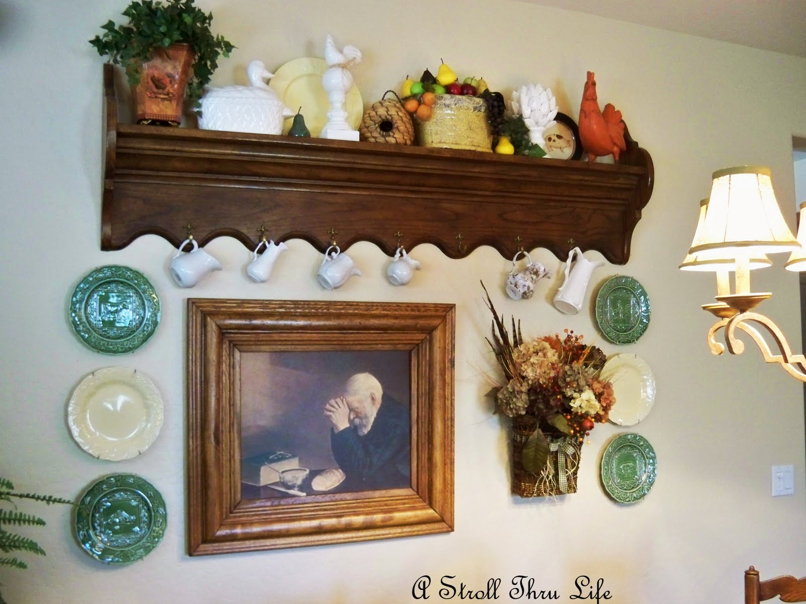
The dining area of the room also has some really huge art. The plates and sconces are neutral so the total spotlight is on the art. This piece is 31/2 ft. x 41/2 ft. Since you see both the mirror and the painting at the same time, the painting needed to be large enough to balance the size of the mirror visually. A small painting here would be totally off scale. I think the extra tall candlesticks help to balance the size, and the wall has impact without being cluttered.

The buffet has another piece of art displayed on an easel as part of the vignette.
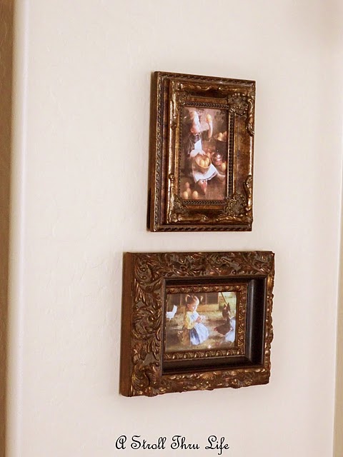
The corner wall in the dining room also has 2 small pictures that I just placed there. The frames and prints tie in well to the gallery wall in the hall, so it all goes together.
I have several antique clocks that I inherited from my mom. Instead of filling the whole wall up with them, I decided to use just a few and hang some art for interest. This makes the wall much nicer to look at and not cluttered with too many clocks.
I decided to use this round mirror in the familyroom. Again it is a rather large piece measuring 45 in. wide with a rather substantial frame. I think it also helps to open up the long narrow size of the room. I put a wall pocket on one side and then used a corbel on the other side. I deliberately kept this space simple since there is an entertainment center with bookcases across from it that demands a lot of attention.
Here you can see the size of the frame. It is substantial enough to command attention as the focal point on the wall. A smaller framed piece would not have the same impact.
I think we all know the value of using pictures on bookshelves. Just hunt for pretty frames and you can download prints for free off the internet.
The adjoining breakfast area wall is quite busy with this collage. However, you don’t see the bookcase area and this wall at the same time. You just see the sofa area and this area, so they don’t fight or make you feel like every wall is weighed down with “stuff”.
Even when you’re doing a collage wall, keep it contained and leave some breathing room around it.
I also like to use art in unexpected places in the kitchen. This little rooster print I got off the internet and the frame came from GW. It just helps to tie vignettes together and doesn’t take up any counter space.
On the other side of the kitchen I have another piece hanging on the wall under the cabinets. This is a cross stitch piece I did about 30 yrs. ago. It’s always hung in my kitchen somewhere ever since.
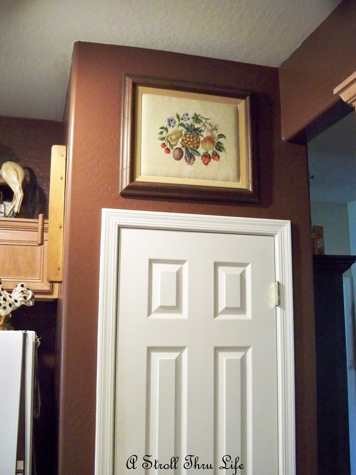
Since we all love to put things on the tops of our cabinets, we have some empty wall space like above the pantry door. I love to use it.
This is another needlework piece I did 30 yrs. ago. It helps the eye travel from the tops of the cabinet around the room to the next set of cabinets.
The main thing I always try to keep in mind is to make all of the art and mirrors a part of the furniture arrangement. Nothing hung too high or too low. The biggest mistake I see made is art hung so high it is floating on the wall and has no connection to the furniture underneath it. Also, use art that is big enough for the space, or else group several pieces together. One lone small picture hung way too high above the furniture is not appealing and will always make the room look off. Most designers agree that art or mirrors should be hung no more than 6 to 8 inches above the furniture. There are exceptions, however, keep it low.
I hope this helps you with placing all of your favorite art in just the right places and try some of those huge pieces. You may find that you like it.


