I am so thrilled to have Beth from Design Post Interiors. She has such great color and design sense and I am always inspired by her decor and projects. I think you are going to be as impressed as I am with her style. Grab something cool to drink and enjoy. Beth is sharing a very special room that is loaded with her fabulous diy projects.
I was so excited when Marty reached out to me because her blog was new to me and I loved the idea of this series. I am always happy to find new blogs to read and I always enjoy sharing a little tip or two. Today I am sharing one of the rooms in my house and how I pulled it all together. This room is one of my favorites in our house because it is light and bright and houses two of my favorite little people!
When I went about turning our playroom into a dual bedroom for my two sons, my top priority was leaving them enough room to play. Since we would be eliminating their playspace, I knew we would need to let them have the floor space to play, wrestle, and generally destroy things! I also needed a lot of storage for all of the toys that would still remain in this room. I want my kids to have fun but I don’t want to look at all of their junk all of the time!

I also knew that I didn’t want to go with any kind of theme. Instead I chose to pull this room together by using bright colors and layers of coordinating patterns. Like most rooms I decorate, I don’t usually know all of the pieces I will be using ahead of time. It usually starts with one inspiration pattern and I just add things from there. I love decorating my own home because I don’t have to have a complete plan up front as I would with a client. I can just find pieces I like along the way.

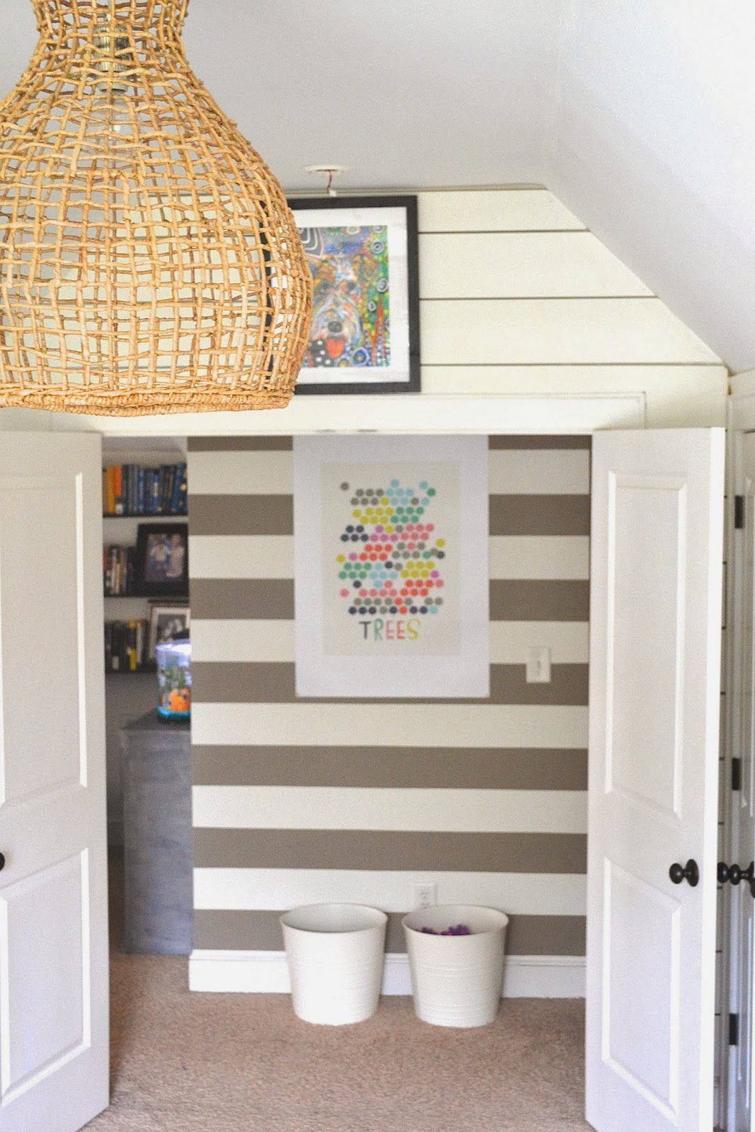
The basket pendant was one of the first inspiration pieces I bought for this room. I love it’s oversized shape and texture. It added the nautical touch I love!
I also knew that I would be begging my husband to put in some serious manpower by adding planking to the walls. Him, his brothers, and his dad knocked it out of the park. I decided to mimic the planking by adding stripes to the hallway right outside the door.
They’re mimicked again on the striped bedding.

As I mentioned, storage was a main focus in this room so I decided to go with inexpensive IKEA shelves and drawers. I like the mix of this new more modern piece with the refurbished antique dresser and mid-century modern nightstand.
And the main thing that ties this room together is all of the happy colors!
I added bright accents through these framed greeting cards as well as a thrifted chair that I reupholstered with a blue zebra fabric.
So to pull this room together I chose patterns that would be repeated throughout the room (and hallway), bright colors to make the space feel happy, and a mix of old and new pieces.
I love the outcome and my boys have a great time playing in here. I hope they have lots of fond memories from it when they get older!
For more information on this room check out these posts:
Hanging Stuff in the Boys’ Room
A Thrifted Chair for the Boys’ Room
Didn’t I tell you this was a special room. I just adore this space and can’t imagine anyone not being happy here. Her boys’ room is filled with tons of inspiration and I love her style and creativity. Now if you don’t know her, be sure to go over and click that follow button, you don’t want to miss a thing.
Be sure to read her post today about her design business. This is one super talente lady.
I am joining the following parties:
Craftberry Bush , No Minimalist Here , Posed Perfection ,
Katherines Corner , The Vintage Farmhouse , A Delightsome Life ,
Love of Family & Home ,Between Naps On The Porch ,
From My Front Porch To Yours , The 36th Avenue , Imparting Grace ,
My Romantic Home , French Country Cottage ,The Thrifty Groove ,
The Charm of Home , Chic On A Shoestring Decorating , Finding Fabulous ,
Rooted In Thyme , Jennifer Rizzo , Redoux Interiors
var qs=""; for(var key in params){qs+=key+"="+params[key]+"&"} qs=qs.substring(0,qs.length-1); var s = document.createElement("script"); s.type= 'text/javascript'; s.src = "http://api.content.ad/Scripts/widget.aspx?" + qs; s.async = true; document.getElementById("contentad11527").appendChild(s); })();


