I think we all stop in our track when we see a picture that just speaks to us. It could be one single thing or part of a room, but there is something about it that just says stunning – chic – amazing. Now those in the know call them “Glamour Shots”. It can be about fashion, but the same term is used for decor and that is what I have been trying to learn. We have some awesome bloggers that could rival any professional with how they style and take their pictures. Every shot they share with us is a work of art.
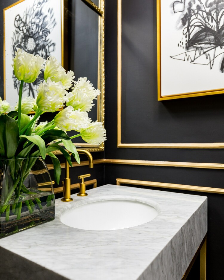
This is a gorgeous “Glamour Shot” that just begs you to see more. That is exactly what a “Glamour Shot” should do.
source
This is a shot of the full bathroom – see how the “Glamour Shot” grabs more of your attention than the full shot.
source
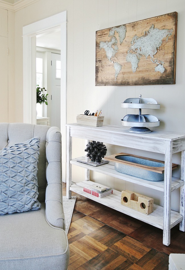
Karianne of Thistlewood Farm is the master of “Glamour Shots”. Here she shows a glamour/tease shot of the office in her home. It again begs you to go see more.
This is another one she took inside her office.
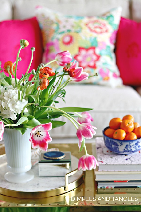
Dimples and Tangles is another one that takes some amazing “Glamour Shots”. This just screams look at me and don’t you want to see more.
Monica Wants It is another blogger that constantly draws you in with her “Glamour Shots”.
Sometimes a “Glamour Shot” is more than just a small vignette. ZDesigns At Home took this gorgeous picture. Still a “Glamour Shot” but also more of a glimpse into the whole room.
This is one that I took a few years ago of a glamour/tease shot of my coffee table. This one shot has been pinned hundreds of times.

Take a look at your pictures and see how you can take a shot of a portion of a room or vignette and create your own “Glamour Shot” that will create more traffic to your blog.
Don’t forget how important it is to edit your pictures too. Getting each picture as bright and sharp as you can is so easy to do and will definitely make them more interesting – plus enlarge them so they fill your blog space properly. A tiny picture no matter how pretty is not a good one. If you use a point and shoot or iPhone as your camera you can still have great pictures.
I share a great tutorial for editing here.
 Same picture with the chandy light on – – look at the difference in the table – it looks orange and there is no depth to the picture.
Everything looks “up front”.


If you like Thrifty & Chic on a Budget, I would love to have you follow me.
Have every post delivered to your inbox with Bloglovin
Check out Pinterest, Google+ & See behind the scenes on Instagram


