I have been stressing over this family room situation until it is ridiculous. This is not rocket science even though I am trying to make it feel that way. Since I need a larger console, I have taped out the floor and done all kinds of things to try to get the feel of a bigger table. So I finally came to my senses and just moved the console table from the entry hall in here since that is the width I really need to accommodate the larger TV. Now I can really visualize the space and not just look at some tape on the floor. This has been enlightening. I am following my own instincts of When In Doubt – DON’T RUSH. Decorating a room or entire home is not a sprint. Take your time to think it through and don’t make costly mistakes. This room is not about to be filmed for some major Magazine or some fabulous HGTV spot, so I really don’t have a time frame for when this needs to be resolved. It’s funny how we think every room needs to be “done” in 20 minutes or at least I seem to feel that way. If what I currently have going on never changes, it will be perfectly fine. This room is functioning and much better than some I’ve had in the past, so the simple little addition of a larger TV is not earth-shattering. Ok, now that I’ve had that little talk with myself. – – —
Moving the console table in from the entrance really gave me a perspective about size. This is not the style table I want, but it does show me the size I really need for the new TV. I really think I want to go with a console-style. Also, I would hang the TV on the wall so it would be a little higher if this was the height of the console we decide on.
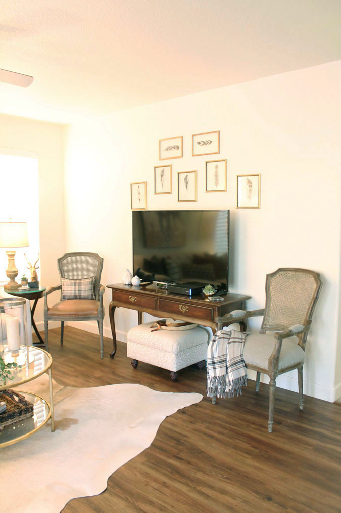
This is definitely the max size table we could use for this room. Using the same furniture arrangement as before works but is definitely wall to wall. The same end table, and two chairs as I had with the smaller console. I brought in the ottoman to hide all the wires. If you just look at this one wall, it seems to work – sort of.
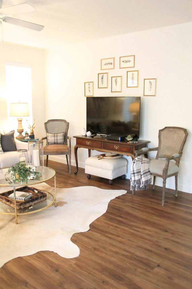
This really made me see that I do not want an open table. I think I need some kind of cabinet so things aren’t so leggy. This just looks like leg after leg after leg. Nothing substantial to balance out the two gray recliners on the other side of the room.

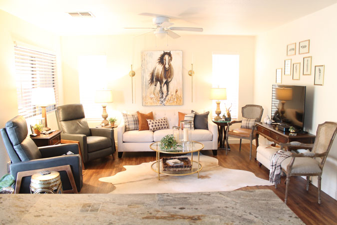
Before the larger TV, this is what this space looked like.
This is a small space and now this is looking really crowded. ( This just makes me feel closed in and the furniture looks wall to wall )
How about a console table that has some bulk and no open legs, then at the end of the sofa on the TV side replacing that corner with a floor lamp and an olive tree. I would put the luggage leather chair where the light gray one is. Hang the TV and do a more substantial gallery wall. These are my current thoughts, subject to change any given second. haha Remember – When In Doubt – DON’T RUSH.
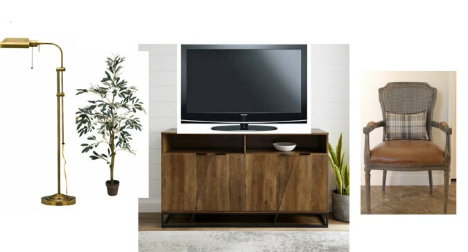
Here’s another one that I am loving – https://www.hayneedle.com/product/sauderharveypark54inentertainmentcredenza.cfm
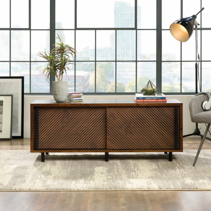
What do you think? Cabinet Console, floor lamp, olive tree – or????????? ( I am really trying to take my own advice of When In Doubt – Don’t Rush.) I need to just think about this for a while. So on the other things and wait until I find the perfect console and go from there.
Hi Marty,
You are smart to wait and take your time if you are not sure what you want. This way you do not have to feel like you want to change it up again. This is especially true when you are buying furniture. I am like you and like to get things done right away. Once I have the vision in my head I want to put it in play. It is hard sometimes to slow down and live with something or change things up. I know whatever you pick will look great.
Have a great week.
Yes, definitely like the idea of a console table. And I feel a more substantial wall grouping above the TV is needed. The light framed prints and the light wall do not stand out. Maybe a mixed collage of things or bigger prints with color. Your room is so delightful and I could imagine sitting there watching TV. Your ideas are always great!
I agree about the “leggy” look. I would use a solid entertainment piece and use the occasional chairs elsewhere. You’re on the right track – it just takes time to get it right.
If you’re hanging your tv, I’d try it with the console you have now. The mirror front adds some depth to your room and it can be centered under your tv. Maybe add some new frames around your prints you now have to work with the tv. Take it slow like you stated. My living room is in a state of taking it slow right now, so I completely understand. Good luck!
This might make sense or not but with the “color” weight of the two recliners I think a cabinet like you are showing makes sense. It will add a similar visual weight to the room. I kind of think those two accent chairs need to go too as they bring in a more traditional style and what you’ve got going now is a more modern style.
Marty, your little talk with yourself is hilarious… it made me laugh sooo hard…. just the type of talk I give to myself so often !! Thank you for putting it in writing. soooo funny. and such good advise to take your time. Thank you so much for a chuckle this morning.
Thanks so much. I seem to need to have “little talks” with my self more and more. Patience is not a virtue God gave me, but He keeps reminding me that it really is a virtue. Marty
By all means take your time. I wish I could somehow attach a pic here to show you what I did when we down-sized from a 2900 sf home to a 1450 sf apartment. I roamed stores for a while before finding just the right piece, but when I saw it, I just KNEW it was right. It’s a substantial piece that was actually on display as a buffet in a dining room. But we have our 65″ TV sitting on top of it and I have loads of storage inside. Absolutely love it and because of its size, it is the statement piece for the room. So many have told me it looks like it was made for the space. Our living room is smaller than yours so I probably sound crazy which is why I wish I could just show you the pic 😉
So my suggestion is simple—DO take your time, you’ll know the right piece when you see it, it can be larger than the table you now have in the space by simply eliminating the 2 chairs on either side of the table. Move them out and only use when you have company.
I would love to see your room too, I am sure it looks amazing. Moving the two chairs out is an option I hadn’t thought about. Might give that a try. I will keep looking, I am sure like you, I will know when I see it and then it will be perfect. Thanks for your help, Marty
I would move both chairs beside the TV to another room. It would provide more openness and less “leggy” look as well as give a look of less is more.
I have already moved one and may will move the other one too. Just have to give it some thought. Marty
I know what you mean!!! Sometimes it is just difficult to style your own room. I can walk into someone else’s room and just know what to do, but with my own i let emotion cloud my judgement. I really like the idea of the tree in the corner:) Good luck!!!
Oh I love the tree. I bought one and can’t wait to show you guys. Marty
You are so right about taking your time. The idea of putting the console table in the room is brilliant. Gives you a better perspective. The right piece out there somewhere! My late MIL built a new house and even before moving in, put all her picture hangers on the walls. Talk about finishing a room in twenty minutes….
Oh my word, I’m not nearly that organized or have that much talent to see how a room should be done. Amazing. Marty
You can use the two chairs in the entry or maybe one in the guest room. Using them for company is a good idea.
If the tv is on wall could you use your two large sleek not too heavy sconces by the horse Or something similar on the sides of TV? A cluster of little things might be too busy. Scale and softly modern sleekness seems to be your direction Your right. Slow and steady. Have fun.
Thanks for the suggestions. I am taking it slow and looking for something that really grabs my eye. Marty
I agree as is for the moment is too leggy. That is something we all need to keep in mind…take a look around our rooms. That’s a common mistake. And maybe move one of the chairs to another room until you actually need so much seating. And the train of thought not all seating needs a side table. That is another common mistake especially in small rooms. It does feel closed in at the moment…..but it’s a work in progress.
Thanks, yes it is a work in progress, so for now I am just keeping my eyes open for a console I can’t resist, then we will see where we go from there. Marty
I love your decorating style Marty, and I think our styles are similar. I also have a very small living room, but a very large television stand (60″) which takes up one wall in my room. I have a 42″ tv on it. I had to finally eliminate my occasional chair similar to your two. I agree with others, unfortunately I think the two chairs need to be relocated to another space. I think you need a substantial console for your television and maybe look for one with cupboards and drawers. I have a lot of storage in my piece and it sure has come in handy. I even store candles and essential oils for my diffuser in one of the drawers. So convenient! I know you will find the perfect piece, just take your time. I saw a great piece at Home Goods the other day which actually tempted me to replace mine, but I managed to resist LOL!
Thanks so much. Yes, I definitely need a console table, no more legs. Removing the chairs is definitley an option too. Thanks for your help. Marty
Hi Marty, you are on the right track; a substantial solid console would balance out the larger tv as well as equalize the weight of the two leather recliners. I read that you are thinking of replacing the end table closest to the TV, but I think you need that lamp there to mirror the lamp on the other side of the sofa. Perhaps a glass & brass small round table? It would remove the visual weight of having that table in that corner. I have seen what you have done to your home and whatever you decide will as usual be tasteful and beautiful. Good luck!
Thanks so much, I appreciate the comment about the end table. Good idea. Marty
A designer friend of mine made this comment about my room one time and I think it is applicable here. Your room is weighted too much to the bottom half of the room. The horse art is beautiful, but I think drapes on either sides of your windows hung halfway between the top of the window and the ceiling would give you better balance and raise the eyes up.
I would try it without the chair in the corner, especially if you rarely use it. I would also try putting a smaller table without a lamp between the recliners to lighten up that side of the room. You may want to try putting the end table that is between the recliners now at the end of the couch. Once the chair is gone from there, you can use the weight there.
I tend to move things around, live with it a few days, and see how I like it. I always try to use what I already have before buying something new.
Thanks for the suggestions. I appreciate it. Good ideas. Marty
When you moved there I asked why you didn’t put the bookcases now in your office in there. Maybe an armoire type cabinet would be the answer. Otherwise Marty, the TV goes ! That’s the problem. LOL
I would use a console cabinet to give some weight to that side of the room to balance out the heavy recliners on the other side. It will also give you some storage space which I find is always needed. Then I would remove both chairs from the room to give a more open feel. I would also remove the lamp and table from the left corner next to the recliner and add a floor lamp if you need it for reading. If you don’t need it, then I would leave it open. Keep the lamp and table in the right corner to give some balanced light to that side of the room. And add the olive tree if you like the look at that point. I think some darker elements on the wall would help to balance the heavier darker colors below. Good luck — and I can’t wait to see the results.
Thanks for the input, I really appreciate your ideas. Marty
I concur with eliminating the chair in the corner. The other could be pulled slightly forward and more angled to the conversation area. That way it won’t seem to be competing for the wall space. I’m glad you’re not going to rush the process. I am rarely happy with the result when I pressure myself!