A few months ago we got a new Marshalls close to me and I was so thrilled. I strolled through that first week and it was such a pleasure to have this wonderful store close by. I hadn’t been back in a while until yesterday. I was running a few errands and Marshalls is across the street, so I popped in. My goodness, it is so hard to see anything. This place was so piled full of stuff and not much rhyme or reason for how it was displayed. Let me take you for a walk through up and down the aisles from front to back.
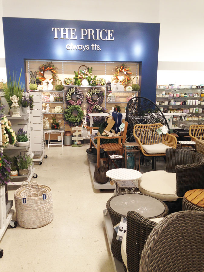
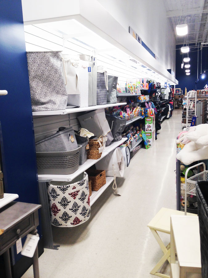
This is the middle of an aisle. I couldn’t figure out what all this display had in common, just a bunch of random things.
Furniture between the pillow aisles with pillows and rugs thrown on top of the furniture.
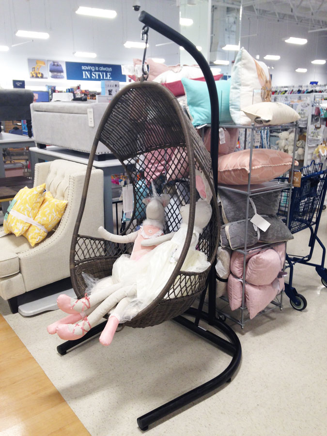
Chairs, lamps and dog toys all together.
How many of the same table do they need?
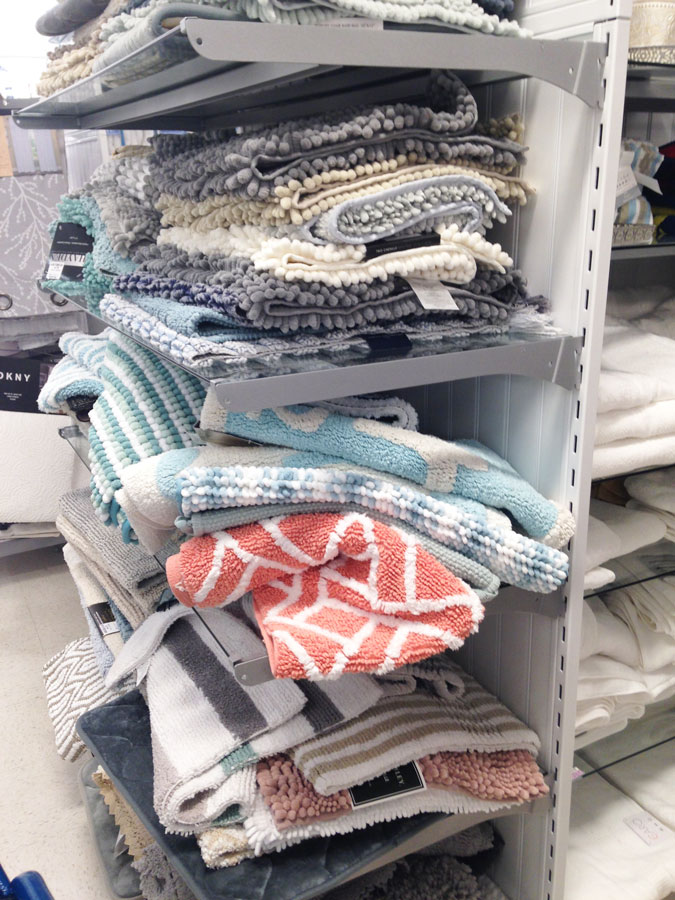
I think there might be some cute rugs in this mess.
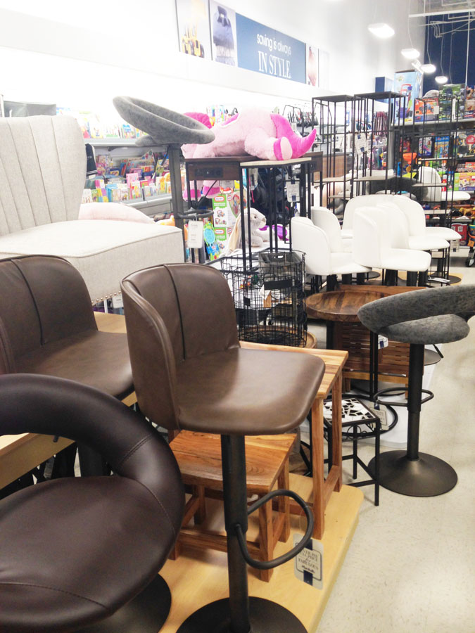
Bed pillows, chairs, end tables and bar stools.
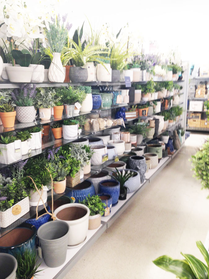
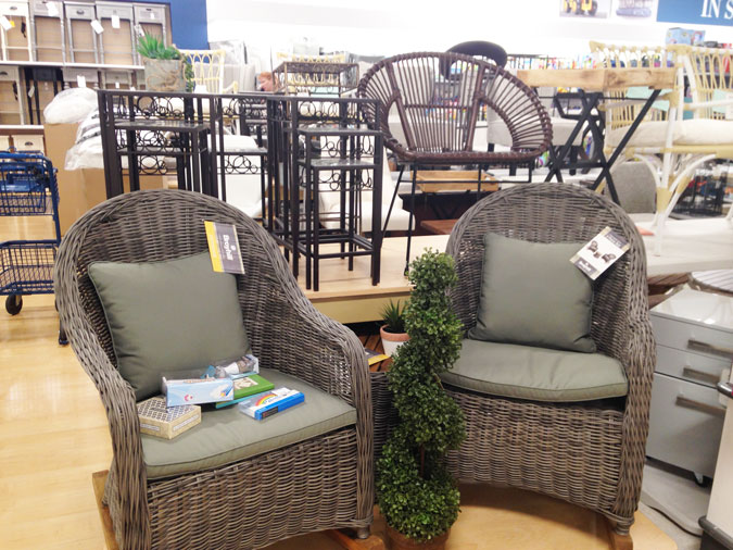
These two rockers are gorgeous and on a little platform by themselves. That is how it should all look if it didn’t have toys on the seats and the floor in front and back filled with potted plants so you couldn’t walk around.
This was not a clearance aisle.
How about some Easter Bunnies mixed in with your bar stools.
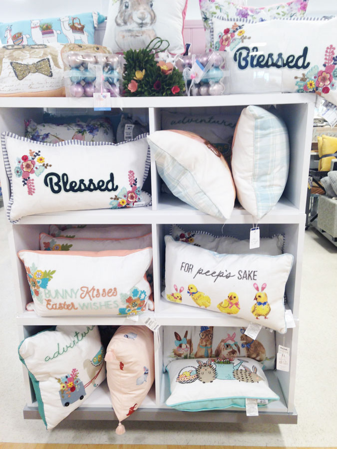
These pretty towels got lost with cardboard boxes of pillows next to it.
Now not sure if they are short handed or what, but I found it really hard to see all of their gorgeous Spring Decor since it was all piled together. I think they really needed about half the inventory they had, then maybe they could display it in a way it would sell.
My Home Goods looked about the same last time I was in. Way too much merchandise up and down every aisle and poorly displayed. Are your stores looking the same way?
To stay up to date on all the makeovers taking place at our new home, I would love to have you follow me. You don’t want to miss any of our“Hits & Misses”.
Have every post delivered to your inbox with Bloglovin
Check out Pinterest & See behind the scenes on Instagram

