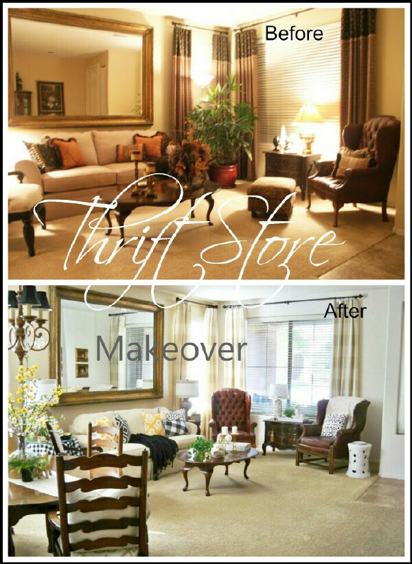
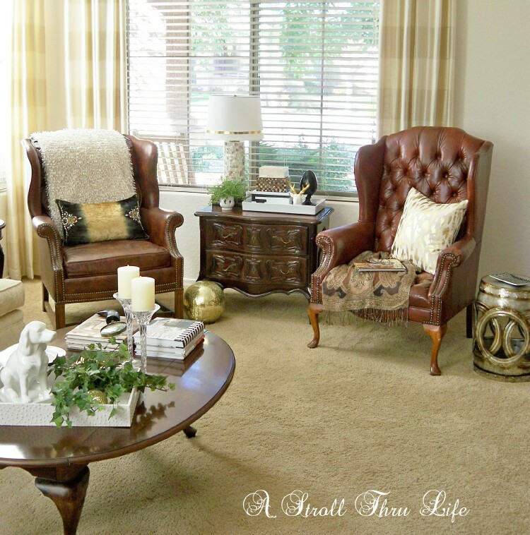
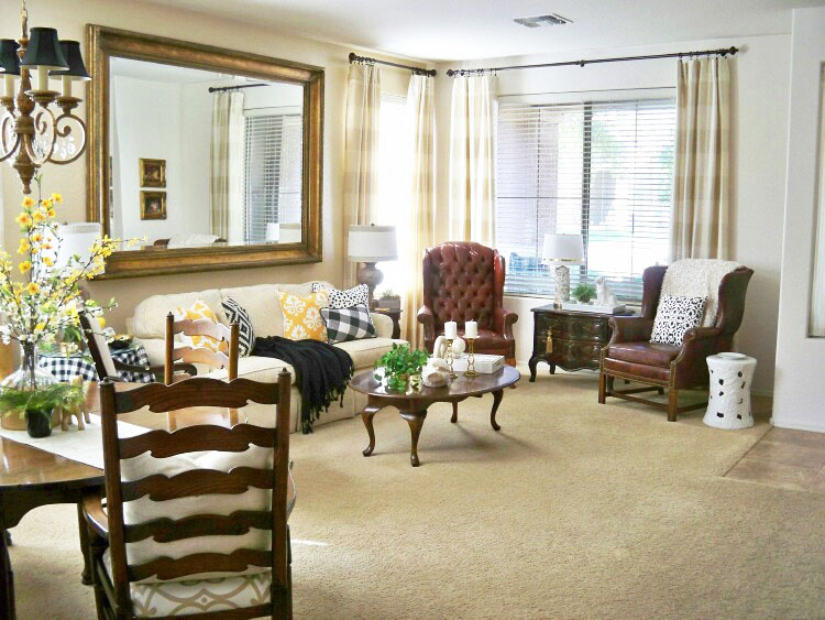
The third Thrift Store Makeover in this series is our Living Room. This has been one of the hardest rooms for me to get to a place that I love.
How to downsize and create your dream home with Thrift Store finds.
Downsizing is harder than you might think. Furniture that you really like doesn’t fit and colors seem all wrong. The space just feels like it is closing in on you. You can’t just throw out everything you have and start over, so how do you make it work?
My previous living/dining area was 25 x 40 ft. Our current living/dining area is 17 x 21.8 ft.
Since the front door opens directly into the room and becomes the walkway to the rest of the house, you are really down to about 14 ft. wide. That creates a really cozy space for two rooms, so the furniture had to be small in scale.
The life saver of this room is the large mirror from our previous house, it almost becomes a mirrored wall and gives the illusion of twice the space. I found it at a design studio, it was so big no one wanted it, so I was able to get it for $229. That’s a great price for a 4 x 8 ft. mirror.
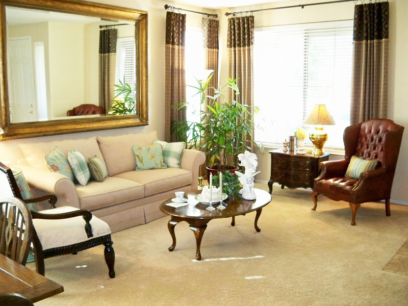
This was the first picture I took after we moved in and the drapes were made. (Sorry, it is a night time pic and my photography skills were seriously lacking.)
As usual, I started changing out pillows right away. This was for a summer look. The sofa was your standard 8ft. sofa. So big for this room that there wasn’t room for an end table on one side. I used the small chest in the front window instead of a larger console. This was used an an end table in my previous home.
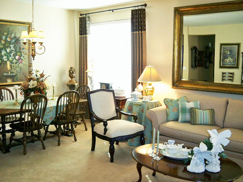
This shows the dining area of the room. You know how you get used to furniture that has been in one space and think it belongs there. This table and chairs had been in my dining room in the previous house, so of course I put it here in this house. Now you can’t really tell in the picture, but there is only about 12″ from the back of the dining chair and the back of the white living room chair. Also, you couldn’t walk behind the table and chairs, it was so close to the wall. You had to move the white chair and pull the table out to use it. Not very convenient at all.
The first drapes that I used in the living room were gorgeous, I absolutely loved both fabrics and how the brown drapes looked, however, they definitely do grab your attention and make the walls appear closer. Sometimes it is best to keep the drapes neutral to match the walls.
The next drapes were better. I painted the walls a soft beige with camel undertons and found some $3 fabric on clearance and made new drapes. I added a topper to them in a soft camel color. These really helped to lighten up the space. I later removed the topper and I currently use them in the familyroom. (remake and redo if possible to get the look you want)
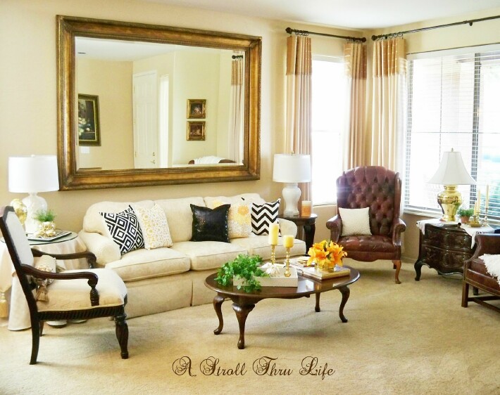
The sofa has been downsized also. Changing out an 8 ft sofa for a 61/2 ft one with low profile arms definitely fits the space better. (This is also a super bargain that I got when a neighbor was moving and couldn’t use it. $100, can’t beat that.)
Using a really small end table on one side of the sofa and a small skirted table on the other also conserves space. This little table was a Goodwill find for $15. It just needed a little touchup with some stain.
A small scale open arm chair allows you to see through, under and around the chair instead of blocking the view and creating a solid barrier. (This piece was in my old house and was a floor model clearance chair. I think it was around $150.) Since there are legs on the dining table and chairs, the skirted table brings color and something solid to this end of the sofa while it still blends into the wall since it has a neutral fabric. A table with legs would look crowded even though it would be more open. Just too many legs in one spot. Table rounds are really inexpensive and a Goodwill tablecloth looks amazing. (Tip – I use a plastic tablecloth under the white one to give it a fuller look. )
I think one of the biggest changes in making the room appear larger is when I painted the walls white and changed out the drapes so they match the wall color. The drapes just fade into the background rather than stand out and draw attention, plus hanging them from the ceiling creates the illusion of space and height. They are a beautiful silk beige and white stripe. (These are also a thrifty treasure since they were my daughters. She got new and I got her old. She has fabulous taste, so I love getting her hand-me-downs.)
It took me three years to realize I could swap the breakfast and dining tables and have more room in both spaces. (I know. SOMETIMES I am a little slow) Now you can use this table without having to rearrange furniture and the bonus is this one has 4 leaves, so it can extend for family gatherings. The second advantage is the room looks so much more open and airy.
I am asked about the two leather chairs all the time and why I chose them for the living room. Well, they are treasures I found at a consignment shop years ago and I was so thrilled to have a real leather chair that I bought both. I paid $100 a piece. The tufted one doesn’t have any tags on it, but the other one is Ethan Allen. I just can’t seem to part with them and this is the only place they fit, so they stay. I think you have to keep some favorites regardless of size, style or space. (Are you beginning to see a pattern here, $100 chairs and $100 sofa)
The things I have learned during the last 10 years is you can use some of your larger furniture and art, just be careful to keep it to a minimum in any one room. Smaller scaled, open and airy pieces don’t close a room in, but be careful of getting too leggy. Oversized stuffed furniture pieces and big boxy cabinet pieces are really hard to work around in a small space. One or two pieces can become a focal point and give a room character if the other pieces are more in scale with the room size, so pick and choose which pieces you want to have as a focal point. Keeping the walls and drapes light and neutral were the most dramatic changes to the room. That one change alone seemed to push the walls out and create more space.
Every space needs to evolve, so keep making changes until you finally get the look you are seeking. I am not sure if I will ever have this room “done”, but for now I love it.
The sofa and small end table were the only purchases for this room makeover. All the other pieces came from my previous home – here is the thrifty shopping breakdown.
- Wall mirror – $229
- Sofa – $100
- Leather Chairs – $100 ea.
- Floor Model Chair – $150
- End Table $15
- Small Chest – Dining Table – Coffee Table (8 houses ago)
You can still link up to Inspire Me Tuesday – We want to see everything.
If you like Thrifty & Chic on a Budget, I would love to have you follow me.
Have every post delivered to your inbox with Bloglovin

